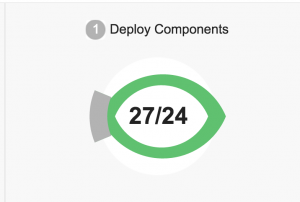
For the love of #DeploymentFish
Summer ’14 brought us a new Deployment Status page that gave us a real-time monitoring tool on what happens during a change set deployment. It allowed us to somewhat estimate how long the deployment will take, and it also allows us to cancel the deployment if it encounters an error early on.
But in my opinion, the best “feature” that the new page brought to us was the Deployment Fish.
The fish itself is a bug caused by the circular progress chart on the page that tells you how many components have been deployed. If you have 20 components in your change set, then the circle will by half way filled when you are at 10 / 20, three quarters filled at 15 / 20, and completely filled when all 20 / 20 components are deployed.
The problem is that even after you have finished deploying all your components, the system appears to deploy a few more components that are not part of the change set. The leads to a progress of something like 23 / 20, which is beyond the 100% limit of the circle. So the circle breaks and twists itself into a shape that looks like a fish.
I began to refer to the bug as a deployment fish because of its similar look to the Jesus fish religious symbol. The size of the change set and the unpredictable amount of “extra” components added to it leads to fishes of all different shapes and sizes, some of them more fish-like then other. This turns the deployment into a game of fishing because you never know if you will have a good catch or not.
The first public example I could find was this tweet from Daniel Hoechst in July 2014.
Something's not right with this deployment. 17/15 components? And what's up with that doughnut chart? @asksalesforce pic.twitter.com/wogtaZt3m8
— Daniel Hoechst (@dhoechst) July 22, 2014
I am not sure how Daniel missed the shape the error was causing, but Brian Kwong was quick to point it out with some good puns for good measure.
@dhoechst @asksalesforce looks like a fish, not a donut. Something fishy with your deploy components?
— Brian Kwong (@Kwongerific) July 22, 2014
The bug remained relatively unnoticed for quite a while on the Twittersphere. Then in March 2015, I expressed my love of the fish with a tweet.
I <3 you, deployment fish. pic.twitter.com/jE1VBYgSHz
— Scott VonSchilling (@Scott_VS) March 25, 2015
This tweet was quickly retweeted and eventually the #DeploymentFish hashtag was born. Talks of buttons, t-shirts, and other merchandise floated around the community. People would tweet out their good catches and their bad catches. The trend even made it to Salesforce themselves, starting with the director of product management.
@shawnawol @mpusto @dancinllama @BotosCloud @Scott_VS this chatter made me ☺ Planning to fix that for winter….but maybe we should keep it?
— John Vogt (@vonbytes) March 27, 2015
And true to his word, the bug was not fixed in the Winter ’16 release. Salesforce legitimized the deployment fish even more by including it as a multiple choice answer in their Trailhead training site.
So why all the love for the deployment fish?
Deployments are stressful, especially when you are deploying into production. It might even be one of the worst moments of being a Salesforce developer or admin. First you have to worry about the process completing successfully, then you have to worry about what happens after the changes go live.
The fish provides a cute distraction from the task at hand. It gives you something to look forward to in the middle of your deployment and something to share on your Twitter feed as you wait for it to finish.
The deployment fish shows us how games and mascots can really help workers get through the hardest parts of their jobs. This “bug” should serve as an inspiration for UI designers in future upgrades to the platform.
But for now, keep fishing, everybody!
